Grids show data organized into rows and columns like a spreadsheet. Each row represents one record, and each column a field or attribute of the record. This makes it easy to work with multiple records at one time. Each grid also functions as a customizable report. Once you get the grid filtered and formatted the way you want then you can Print the results or Export to Excel.
FOURA uses grids to display and edit data on Browse Forms, Support Forms and within the tabs of Entry Forms.
An example of a grid is shown below:
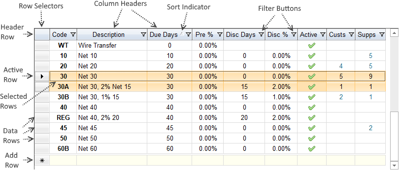
Each grid includes the following common elements:
| Element | Description | ||||||||||||
|---|---|---|---|---|---|---|---|---|---|---|---|---|---|
| Header Row |
The header row is located at the top of the grid. It consists of a row selector and the column headers.
Tip: You can click the header row selector to quickly select all rows in the grid.
|
||||||||||||
| Active Row | The active row is indicated by a black arrow in the row selector. Clicking on a row will make it the active row. There can only be one active row at a time and this row will always be included in the selection. | ||||||||||||
| Selected Rows | Selected rows are highlighted in light orange. You can select all, none or only some rows. Certain actions, such as Copy, only include selected rows. | ||||||||||||
| Data Rows | Data rows contain the actual data returned from the database. There will be one data row for each record returned. Depending on your permissions, you may be able to edit data rows. | ||||||||||||
| Add Row | The Add Row is a special placeholder row that you use to enter new records. It will appear at the bottom of the grid when editing is enabled and the corresponding row selector will show an asterisks ( * ). | ||||||||||||
| Row Selectors |
Row selectors are located to the left of each row. They are used to display the current status of the row. You can also click on the row selector to say any pending changes for the row and to select the row. The status symbols are as follows:
|
||||||||||||
| Column Headers |
Column headers are located at the top of each column. The column header displays the column caption, sort indicator and filter button. Column headers respond to a variety of click actions:
|
||||||||||||
| Sort Indicator | A sort indicator will appear in the column header if you sort the grid by that column. The indicator will show an up arrow for ascending sort order and a down arrow for descending order. | ||||||||||||
| Filter Buttons | Filter buttons will only appear if the grid does not include a Quick Filter. You can click on the filter button to manage filters for each column. If a column has any active filters then the filter button will change to include a solid blue background. |
You can select entire rows or individual cells in the grid. Whatever you select will be highlighted with a light orange background. Any selections will be included when you select Copy from the Context Menu or when you press Ctrl-C. Here are some ways to make selections:
FOURA grids also support complex selections. You make these by holding down the Shift or Control key while using one of the above methods.
If you want to extend your current selection to include adjacent rows or cells then hold down the Shift key and click on another row or cell. The selection will be extended to where you clicked. You can also extend your selection using the arrow keys, as long as you keep the Shift key remains held down.
If you want to select additional rows or cells that are not next to one another then hold down the Control key and then select a new region using any of the above selection methods. As long as you keep holding down Control you can keep adding more individual rows or cells to your selection. You can also de-select an individual row or cell by clicking on it while Control is held down.
Your selection can consist of rows or cells, but not both. If you change selection types then your previous selection will be cleared. For example if you drag-select five rows and then attempt to add an individual cell then your row selections will be cleared. Also, using any of the navigation options (First, Previous, Next, Last) will reset the select to the newly activated row.
You can change the sort order for rows in a grid by clicking on the Column Header of the column that you would like to sort by. The first time you click a column header the rows will sort ascending. If you click the same column header again then the sort order will toggle between ascending and descending. You can also sort by right-clicking a column header and selecting a sort option from the Context Menu.
If your grid is currently sorted then you will see a Sort Indicator in the column header. This indicator will show an up arrow for ascending order and a down arrow for descending order.
You can remove your sort order by selecting Remove Sort from the column header Context Menu. Removing a sort order will not change the current order of the rows, but after removing the sort any newly added or re-loaded records will appear in the default order.
You can group data by one or more columns to summarize information or examine it from a different viewpoint. The Group By box (located directly above the column headers) shows which columns are currently being used to group data. For each grouping field the grid will show a header with a count of records in the group and any Totals.
 ) in the toolbar to show it.
The following diagram shows how to group tax rate information by State and County:
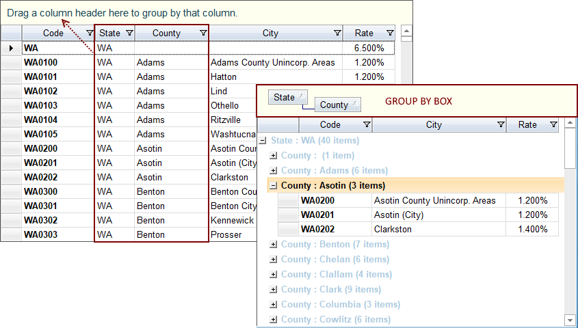
You can toggle the sort order of a grouping column by clicking on it in the Group By Box.
The toolbar includes the following Group By options:
| Option | Description |
|---|---|
|
|
Group By - Click this to show or hide the Group By Box. When hiding the Group By Box any grouped columns will be returned to their original positions in the grid. |
|
|
UnGroup - Clear any existing groups and return any grouped columns to their original position in the list |
|
|
Expand All - Expand all groups |
|
|
Collapse All - Collapse all groups |
You can add totals to any column by right-clicking on the Column Header and selecting Show Totals in the Context Menu. After enabling totals a new Total Row will appear at the bottom of the grid. If the column is numeric then the total row will display the Sum of values, otherwise it will display a Count of rows. You can continue to totals for additional columns as needed.
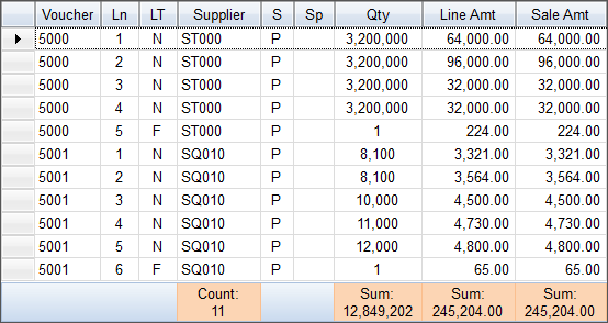
If grouping is enabled then a Sub-Total Row will be included at the bottom of each group. Totals for each group will also be displayed in the group header.
To remove totals from an individual column right-click on its Column Header and un-select Show Totals (clicking will toggle between selected and un-selected).
To remove totals from all columns right-click on any Column Header and click Remove All Totals.
Filtering allows you to show only the rows of interest that meet your filter criteria. FOURA includes two different ways to filter grids. Browse Forms include a Quick Filter that you use to define, apply, save, and share your own custom filters. Support Forms and stand-alone grids (in tabs or on popup forms) use internal column filters.
Grids that use internal column filters include a Filter Button (  ) in each Column Header. Click this button to show the filter options. If you select Custom then a custom filter dialog box will appear and guide you through the process of creating a custom filter. The filter buttons will highlight blue when a filter is set for any column. The custom filter dialog will show any existing filters and allow you to change them.
You can also define filters by right-clicking on a cell and selecting one of the following filter options from the Context Menu:
If a grid can be edited then the grid toolbar will include a Lock button (  ). Editable forms will automatically open unlocked if you have the required permissions. Any editable grids on the form will automatically unlock when the form unlocks.
To edit a cell just click on it. If the cell can be edited then it will enter Edit Mode and you will be able to change its value. Cells may use a variety of Input Controls. Please see the Input Controls topic for more information.
Once you begin editing a cell, the row selector will show the Pencil icon. This icon indicates that there are changes to the row that have not yet been saved back to the database.
FOURA will automatically save any pending changes whenever you click Save (  ), change the active row, click the row selector, lock the form, use any workflow options, select a quick filter, re-query, or attempt action that might cause your changes to be lost. If you attempt to close the form while there are pending changes a dialog will appear asking if you would like to save.
If changes cannot be saved then whatever action you were attempting to do will be cancelled and a message dialog will appear explaining what is wrong and what you need to do to save the record.
 ) then you must resolve the validation error before you can save. To view the validation message hover your mouse over the icon. The validation error icon will also appear in the specific cells that are invalid.
Press the ESC key on the keyboard to undo your changes. Each time you press ESC FOURA will undo more as follows:
 ) from the toolbar. The pencil icon will disappear when all pending changes to the row are undone. If you undo the add row, then no record will be added.
Context Menus appear when you right-click a cell or a column header in a grid. Context menus provide options that are related (in context) to the the cell or column that you clicked.
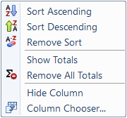
Right-click on any column header to show the following menu:
| Option | Description |
|---|---|
| Sort Ascending | Sorts by the selected column in ascending order. This will replace any previous sort order. The column header will show an up arrow sort indicator. |
| Sort Descending | Sorts by the selected column in descending order. This will replace any previous sort order. The column header will show a down arrow sort indicator. |
| Remove Sort | Removes any existing sort order. This will not immediately change the order of any existing rows. To see the rows in the default order press F7, select Refresh from the Records menu or click Query in the Filter Bar. |
| Show Totals | Turns on Totals for the selected column. For numeric columns this will show a sum at the bottom of the grid. If Grouping is enabled, a sub-total will be displayed in each group header and each group footer. |
| Remove All Totals | Removes all totals from all columns. |
| Hide Column | Hides the selected column. Use the Column Chooser to show the column again. |
| Column Chooser | Displays the Column Chooser dialog where you can show or hide columns, change the caption or format, and review column usage notes. |
Right-click on any cell to show the following menu:
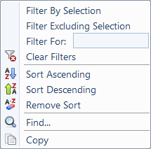
| Option | Description |
|---|---|
| Filter By Selection | Adds a filter to only show rows where the column matches the cell you selected. |
| Filter Excluding Selection | Adds a filter to only show rows where the column does not match the selected cell. |
| Filter For: | Allows you to enter a filter for the column using simple expressions. Click here to see examples. |
| Clear Filters | Clears all filters from all columns. To clear filters for an individual column click the column filter button and select (All). |
| Sort Ascending | Sorts by the selected column in ascending order. This will replace any previous sort order. The column header will show an up arrow sort indicator. |
| Sort Descending | Sorts by the selected column in descending order. This will replace any previous sort order. The column header will show a down arrow sort indicator. |
| Remove Sort | Removes any existing sort order. This will not immediately change the order of any existing rows. To see the rows in the default order press F7, select Refresh from the Records menu or click Query in the Filter Bar. |
| Find... | Displays the Grid Find popup where you can search the currently loaded records. This is the same as pressing Ctrl-F. |
| Copy | Copies the current selection to the Windows clipboard. If you are currently editing a cell then only the contents of that cell will be copied, otherwise all selected Rows and Cells will be copied. |
The Grid Find popup helps you search the information that is currently loaded in the grid. This form appears when you click Ctrl-F or select Find... from the form's Edit menu.
Below is an example of the Grid Find popup being used to search for "Puget Sound":
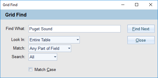
You can use the following search options to define your search:
| Option | Description |
|---|---|
| Find What | Enter the text that you want to find. |
| Look In |
Select where you want to look for the text. Possible choices are:
|
| Match |
Select how you want to search. Possible choices are:
|
| Search |
Select the direction you want to search. Possible choices are:
|
| Match Case | Check this box to treat upper and lowercase letters as different values. |
Once you have entered your search options click Find Next to find a match. If a match is found the cell will be highlighted in the grid. Click Find Next again to find the next match.
Custom layouts are supported for all grids. You can save your preferred layout by clicking Save Layout (  )from the form File menu or from the grid toolbar. Once saved, your custom layout will be automatically re-applied every time you open the form. Custom Layouts include the following settings:
To go back to the default layout click Revert Layout (  )from the form File menu or from the grid toolbar.


