The Column Chooser displays information about each available column in a Grid and allows you to customize the column settings.
To show the column chooser either select Column Chooser... from the Format menu, or right-click on any column header and select Column Chooser... from the context menu. The column chooser will appear as a popup centered over the parent form (the form with the grid). The parent form will be grayed out and cannot be used until you finish changing your column settings and close the column chooser.
Here is an example of the Column Chooser showing the column settings for the Document Library form:
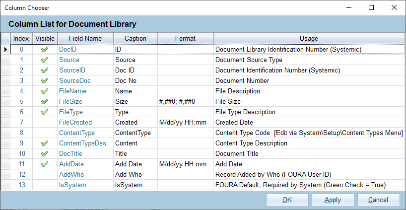
Each column is described below:
| Column | Description |
|---|---|
| Index | A unique identifier for each column in this grid. This is also the default order in which the columns will appear if you are not using a custom layout. This value is read-only. |
| Visible | Whether the column will be shown in the grid. This setting is saved as part of any custom layout. |
| Field Name | The internal name for the field. You can use this to identify the field even if the caption has been changed. This value is read-only. |
| Caption | The caption that will be displayed in the column header of the grid. This can be changed and will be saved as part of any custom layout, however; arbitrarily changing captions can cause confusion and make support more difficult so it is recommended that you leave the default captions unless there is a business need to change them. |
| Format | Determines how to format numbers and dates. Formats only control how the value is displayed - they do not change the value in any way. For more information see the sections below on Formatting. |
| Usage | A brief description of the column and how it is intended to be used in FOURA. For columns that are linked to drop-down lists this will also indicate where you can edit the list. Only members of the rl_Setup Security Role can edit the usage. |
Note: Any changed settings will be immediately applied to the grid when you click Apply or OK, however, if you close the grid these settings will be lost. If you decide that you want to keep these changed settings and apply then every time you use the grid then you must create a Custom Layout.
You can control the way that numbers will be displayed by using a custom number format. Number formats can include up to three sections that determine how to display the number when it is positive, negative or zero. Each section must be separated by a semi-colon. Below is a list of commonly used numeric format codes:
| Code | Description | Example(s) |
|---|---|---|
| 0 | Zero placeholder - show a digit in this position, or zero if no digit is present. | 3456.7812 ("00000") -> 03457 0.34567 ("0.00") -> 0.35 |
| # | Digit placeholder - show a digit in this position, or nothing if no digit is present. | 3456.7812 ("#####") -> 3457 0.34567 ("#.##") -> .35 |
| . | Decimal point - Determines the location of the decimal separator. | 34.567 ("#0.00") -> 34.57 |
| , | Group separator - Determines the group separator and number scaling specifier. | 34567812 ("#,#") -> 34,567,812 34567812 ("#,#,K") -> 34,568K 34567812 ("#,#,,M") ->35M |
| % | Percentage placeholder - Multiplies the number by 100 and includes a percent symbol. | 0.3456 ("#0.00%") -> 34.56% |
| ; | Section separator - Use to specify different negative and/or zero formats. | ("#0.00;(#0.00);n/a") 34.567 -> 34.57 -34.567 -> (34.57) 0 -> n/a |
| Other Text |
Include this text in the output. | 3.456 ("0.0 LBS") -> 3.5 LBS |
You can control the way that dates and times will be displayed by using a custom date/time format. Below is a list of commonly used date and time format codes:
| Code | Description |
|---|---|
| d | The day of the month, from 1 to 31 |
| dd | The day of the month, from 01 to 31 |
| ddd | The abbreviated day of the week, culture specific |
| dddd | The full name of the day of the week, culture specific |
| h | The hour, from 1 to 12 using a 12-hour clock |
| hh | The hour, from 01 to 12 using a 12-hour clock |
| H | The hour, from 0 to 23 using a 24-hour clock |
| HH | The hour, from 00 to 23 using a 24-hour clock |
| k | The Time Zone |
| m | The minute, from 0 to 59 |
| mm | The minute, from 00 to 59 |
| M | The month, from 1 to 12 |
| MM | The month, from 01 to 12 |
| MMM | The abbreviated name of the month, culture specific |
| MMMM | The full name of the month, culture specific |
| s | The second, from 0 to 59 |
| ss | The second, from 00 to 59 |
| t | A/P, the first letter of AM/PM |
| tt | AM/PM |
| y | The year, from 0 to 99 |
| yy | The year, from 00 to 99 |
| yyyy | The 4-digit year |
| : | Time separator |
| / | Date separator |
| Other Text |
Include this text in the output |
Here are several examples showing how a date/time value appears when using different date format codes.
For date/time: "3/5/17 1:09:55 PM":
| Format | Display |
|---|---|
| M/d/yy | 3/5/17 |
| MM/dd/yyyy | 03/05/2017 |
| MMM d, yyyy | Mar 5, 2017 |
| ddd MMMM d , yyyy | Mon March 5, 2017 |
| HH:mm:ss | 13:09:55 |
| hh:mm:ss tt | 1:09:55 PM |
| M/d/yy HH:mm | 3/5/17 13:09 |
