You use input controls to interact with FOURA. These controls may appear directly on forms or as a cell inside of a grid. Each type of control is described below:
Textboxes are rectangular areas on the screen into which you can type text. These are the most common input controls in FOURA. Textbox controls will automatically enter Edit mode whenever they are activated (by clicking on them or tabbing in), provided that you have permissions to edit that value. The values that a textbox will accept will depend on its data type. For example, if the textbox is for a numeric field, such as cost or price, then you will only be able to enter numbers.
Textboxes also support multi-line entry for specific fields. When using a multi-line textbox you can press the Enter key to add a new line of text.
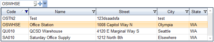
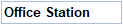
Combo boxes are a single-line textbox combined with a drop down list. With a combo box you can either type a value or select it from the list. Combo boxes auto-complete your entry, matching what you have typed so far with a valid value in the list. If the combo box is enabled for editing then you can show the drop-down list by clicking the down arrow button. Combo boxes can also contain additional buttons. For example, the sample combo box displayed above includes an Add button and a Zoom-link button.
While typing into a combo box you can press Alt->Down Arrow to show the drop down list or Alt->Up Arrow to close the drop down list. Pressing ESC will also close the drop down list. While the drop down list is visible you can use the mouse wheel to scroll the list up and down and you can use the following keys to change the selected item:
| Up Arrow | Select the previous item (up one row) |
| Down Arrow | Select the next item (down one row) |
|
Page Up |
Select the first visible item. If the first visible item was already selected then move up one page of items. |
| Page Down | Select the last visible item. If the last visible item was already selected then move up down page of items. |
| Home | Select the first item in the list |
| End | Select the last item in the list |
Date Pickers are textboxes combined with a calendar drop down. To enter a date you can either type it in using MM/DD/YY format, or you can click the drop arrow to pick the date using the calendar. From the calendar you can click on date to select it, or click Today at the bottom of the control to select the current date.
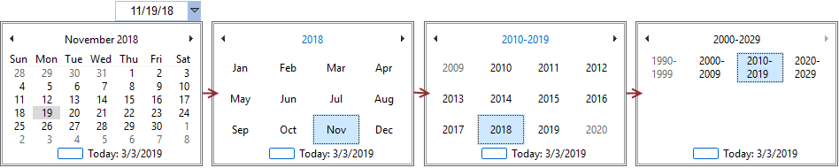
You can also use the calendar to quickly navigate to different months, years or decades by clicking on the calendar header to zoom-out and show larger time intervals. In the sample date picker shown above if you were to click on November 2018 then the calendar would zoom out to show all of the months in 2018 (second image). Then if you were to click on 2018 the calendar would zoom out to show a decade of years from 2010-2019. At any zoom level you can click the left and right arrows at the top of the calendar to move to the previous or next time interval. Once you identify the interval that you need you can click on it to zoom back in and select a specific date.
For example, if the currently selected date was November 19th, 2018 and you needed to select January 15th, 2019 then you would do the following:
The calendar also supports a number of quick keys if you prefer to use the keyboard. Using the quick keys can be faster than using the mouse for experienced users. The following keys are supported:
| Left Arrow | Previous Day |
| Right Arrow | Next Day |
| Up Arrow | Previous Week (back 7 days) |
| Down Arrow | Next Week (forward 7 days) |
| Page Down | Next Month - select same day in following month. If that month does not have that many days then select the last day of the month. |
| Page Up | Previous Month - select same day in previous month. If that month does not have that many days then select the last day of the month. |
| Control -> Page Down | Next Year - select same day in following year. If the current day is February 29th then select February 28th of next year. |
| Control -> Page Up | Previous Year - select same day in previous year. If current day is February 29th then select February 28th of previous year. |
| Enter | Closes the calendar drop down |
| ESC | Closes the calendar drop down (same as Enter) |

Checkboxes can either be checked or not checked. FOURA uses check boxes to visualize yes/no data elements. You can toggle between checked and unchecked either by clicking on the checkbox or by pressing the Space key while the checkbox is the active control.
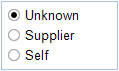
Option Groups are used in cases where you can select only one option at a time from the group. The sample option group shown above is displayed on the Supplier Entry form to select the small business certification type. Only one option can be selected at a time.
When the Option Group is the active control you can use the Up and Down arrows to highlight an option and then you can press Space to select it.
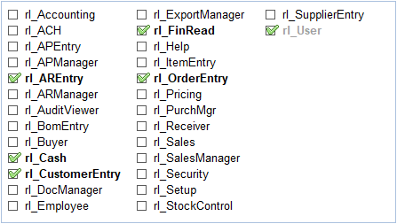
Checked Lists are used in cases where you can select multiple items in the list (the opposite of an Option Group). With a Checked List each item can be checked or unchecked individually.
When the Checked List is the active control you can use the arrow keys to move around the list and press Space to select/un-select an item.
Grids are made up of cells organized into rows and columns. Each editable cell in a Grid control will use one of the other input controls as described above. For example, date cells will use a Date Picker and yes/no cells will use a Checkbox.
For more information on Grid controls please see the Grids topic.
